
Google September 2026 Spam Update: Are These the Tremors?
By Jon Earnshaw|09 Oct 2026|4 min read
The September spam update has finished rolling out. And goodness me, there’s a lot to unpack.
Byrdie. Healthline. Even the NHS.
Some of these sites have looked almost bulletproof for years. They’ve built enormous visibility, invested in their content and performed brilliantly. Now we’re seeing some very big drops across the searches we’ve been looking at.
I’ve been digging into the data with the team at Pi, and Byrdie in particular has really caught my attention. This is a site I’ve admired for its SEO for years. When something that strong starts losing ground like this, you get the charts out and look properly.
I think we could be looking at the tremors before something much bigger. There’s a warning here for anyone whose content strategy has become an exercise in producing more and more of the same. Let me show you what I mean.
For the background on how these updates work, read my guide to Google spam updates. Here, I want to focus on what we’re seeing from the September rollout and what I’d be checking now.
What Google has confirmed
Google’s September 2026 spam update began on Sep 24, 2026 and finished on Oct 8, 2026. It applied globally and across all languages.
Google has not identified a particular type of website or spam policy as the specific target of this rollout. That matters when we start interpreting the movements.
The charts below show movement across selected searches. They give us a starting point for investigation, rather than proof that a named site has broken Google’s spam policies.
Even established health sites are losing ground
Even the NHS. That’s the part that made me sit up. Across the health searches we’ve been analyzing, the NHS, Mayo Clinic and Healthline all show sharp declines around the rollout.
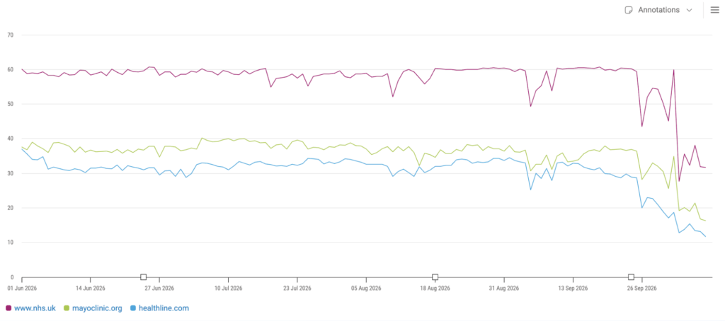
These are some of the names people immediately recognize when they’re looking for health information. Seeing them move together is a reason to get underneath the chart and find out which answers are losing visibility.
Some weakening starts before the confirmed update window. We need to examine that earlier movement as well as the sharper falls around the rollout, rather than assign every decline to the same cause.
I want to know which pages lost ground, which questions they were answering, and what now appears in their place. Looking only at the domain-level line leaves too much unexplained
Byrdie is the reversal that really caught my eye
Byrdie is a great example of why this deserves attention. A site built and invested in with SEO in mind, with years of brilliant performance behind it. Through the summer, it held a clear lead over the publishers shown in our comparison.
Look at what happened next.
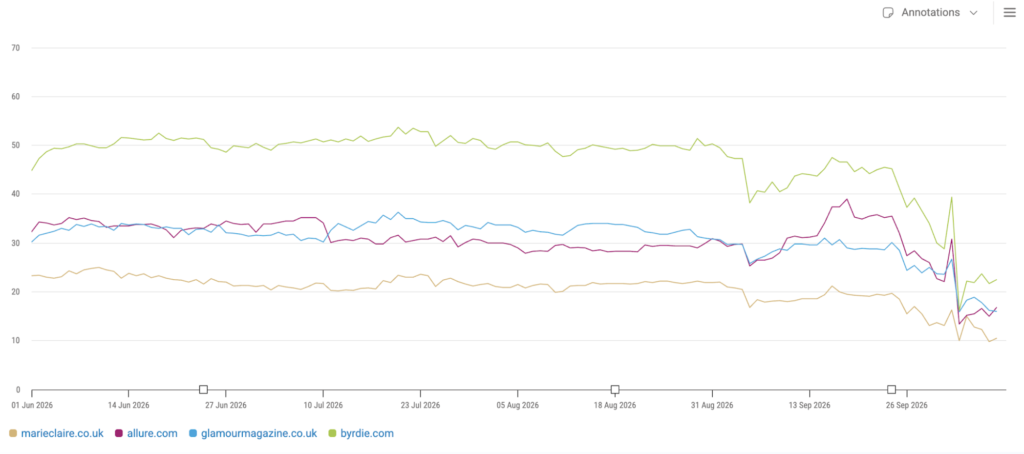
All four publishers shown lose ground, with a further shared fall in early October. So I wanted to take a closer look at Byrdie’s product recommendation searches. The “best this, best that, best of everything” searches that are so important to affiliate publishers.
We examined 12 selected product recommendation searches in Google UK mobile. Every one finished the period below its starting position. There were brief recoveries, but they failed to hold.
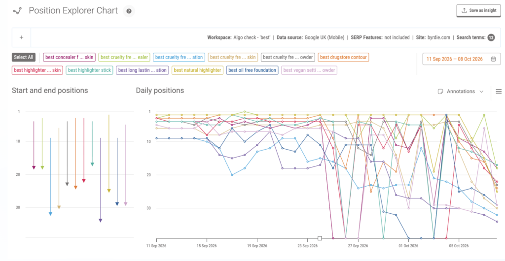
This is a selected set of searches, so it doesn’t tell us what happened to every page on Byrdie or how much traffic the site lost. It does show how quickly a previously successful position can unravel.
If product reviews, buying guides or affiliate content are a big part of your business, I’d be looking at your own search data now.
How much value are we adding?
For months, we’ve been hearing that the way to win in AI and conversational search is to publish more content. Make it more conversational. Answer more questions. Keep going.
And what have we ended up with? A web full of content that sounds the same. The same advice, the same recommendations, the same answers rearranged into another article. It’s boring. Much of it adds very little.
You can make a page sound conversational and still give the reader absolutely nothing new. So here’s the question I’d put to every content team: what are you adding that somebody couldn’t already find elsewhere?
It might be first-hand testing, a useful comparison, original research or an explanation grounded in experience. There needs to be a reason for the page to exist beyond the opportunity to rank.
That is why I wouldn’t reduce this discussion to AI-generated content. Google’s scaled content abuse policy applies to large amounts of content created primarily to manipulate rankings, regardless of whether humans, automation or a combination produced it.
We need to look at the finished page. Does it help? Does it bring experience, evidence or a useful perspective? Or have we simply found another way to say what everyone else is saying?
My suspicion is that we’re seeing warning signs for content produced at scale with too little effort or distinct value. That’s a theory to test against the affected pages, the pages that held their positions and the pages now replacing them.
FAST and DUO: give people something worth finding
This is exactly why I keep talking about FAST content: Firsthand, Authentic, Social and Trusted. Get the people with experience involved. Let them explain what they know, show what they’ve done and put their name to it.
A short video of someone testing a product and explaining the result can tell you far more than another polished buying guide assembled from information already online.
Then apply DUO: Deep, Unique and Original. Go far enough to help someone understand the subject or make a decision. Bring a useful perspective. Include evidence or experience that comes from you.
Depth doesn’t mean adding another thousand words. If you’ve tested ten products, explain what you tested, what surprised you and why you’d choose one over another. Give the reader something they can use.
I explain FAST and DUO in my guide to creating content that performs across traditional search, AI search and AI assistants. These are useful questions to ask when reviewing your content, whatever Google does next.
Why I think these could be the tremors
What concerns me is the range of established sites showing movement. Past success offers less comfort when the very pages that helped build it begin to lose ground.
I’m particularly concerned about affiliate publishers whose buying guides offer little beyond another version of the same recommendations. If the value depends mainly on capturing a search and passing the visitor to a retailer, I’d be looking very closely at what the content adds along the way.
My instinct is that these could be tremors before a bigger shock. I suspect we may see more disruption before Christmas. That is my assessment from what I’m seeing, rather than an announcement from Google.
So get into your data now. Look at your own site, look at your competitors, and ask where your content is earning its place. If you’re responsible for client sites, I’d be checking them before the questions land in your inbox.
What I’d be checking now
Start with the pages and search groups that matter most to your business. A site-wide average can hide the very changes you need to understand.
Find where the losses are concentrated
Separate buying guides, product reviews, informational articles and other page types. Look for a shared pattern across the pages losing visibility. Are they answering similar questions? Do they follow the same template? Is one section doing much worse than the rest?
Look beyond the rollout dates
Compare performance before, during and after the update. Our charts include declines that began earlier, so the timeline is important. Check for changes to your own site as well, including indexing, internal links and page availability.
See who has taken your place
Open the results and read the competing pages. Look for the details that make them useful: evidence, first-hand experience, a clearer answer or a more helpful route to the next decision. What can the reader do or understand after visiting that page?
Challenge the reason for publishing
Take an honest look at pages created mainly because a keyword had search volume. Would you still publish them if that opportunity disappeared? What knowledge, experience or evidence could you add to make them worth reading?
Don’t start deleting pages because a line on a chart has fallen. Find the pattern, check the pages and make changes you can explain.
How Pi helps you investigate the changes
This is where consistent tracking earns its keep. You need to see when the movement started, which searches and pages changed, and who moved into the space you left behind.
In Pi, I start with Visibility Indexes to see the broader picture. Compare your site with competitors across the search groups that matter to your business, look back at performance over time and see where the losses are concentrated.
Then I use the Position Explorer Chart to get closer to the movement. Follow specific searches, compare positions over time and drill into the URLs appearing for them. That’s where a wider decline becomes a set of pages and searches you can investigate properly.
Together, these views in Pi’s keyword rank tracking help you connect the overall trend with the detail underneath it.
That’s how we move from “our visibility has dropped” to a much more useful question: “why have these product recommendation pages lost ground while those pages have held up?”
Keep watching after you make changes, too. Follow the same search groups so you can see whether the pattern improves, rather than judging the result from a single good day.
If you’re already a Pi customer, speak to your Customer Success team about reviewing the search groups that matter most to your business. If you’d like to see how this works for your market, book a Pi demo.
We’ll keep investigating and sharing what we find. I don’t think this is the end of the story.




Never miss a post
Join our mailing list and have our SEO news delivered straight to your inbox.